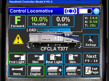
I was going to post this last night, before I lost the internet grrr.
Yes I think there's too much clutter on the Locomotive control screen. I find this is mostly from having two buttons available on each end of the loco picture and the load bar graph. This is the last mockup I did and took a few hints from real loco control screens. With this one the MU'ing, module setup etc are accessed from the setup button, which gives you the choices of setup MU, break MU, setup module etc.

I was trying to figure out a way to get rid of the bar graph to unclutter that area but gave up.
As long as an "operations mode" screen was an option, not the norm I guess it wouldn't be an issue but I think the picture (of some sort) needs to be kept, it helps defines which end is the front (pretty easy with modern day stuff, not so easy with older diesels) and is used to quickly gain access to the loco select screen.
I would like to see more function "slots" available, 16 isn't enough these days.
C.) Ability to control headlights on linked locos
- When the rear light button on the screen is selected, it should turn on the rear most light in the consist.
Is that the way it works in the real world in the US and Canada? It doesn't here. I'd hate to introduce something unprototypical, it's bad enough he had to put in the toy train auto switch headlights on direction change.
Swapping ends of a consist, hmm I remember mentioning that here years ago and getting a no need response. Good to see the idea gaining traction.
- Tim