Author Topic: A less white (low light) screen idea  (Read 13386 times)

G8B4Life

  • Signalman (Global Mod)
  • Conductor
  • *****
  • Posts: 1236
  • I'll think of a catchy tag line one day
A less white (low light) screen idea
« on: February 16, 2018, 10:00:45 AM »
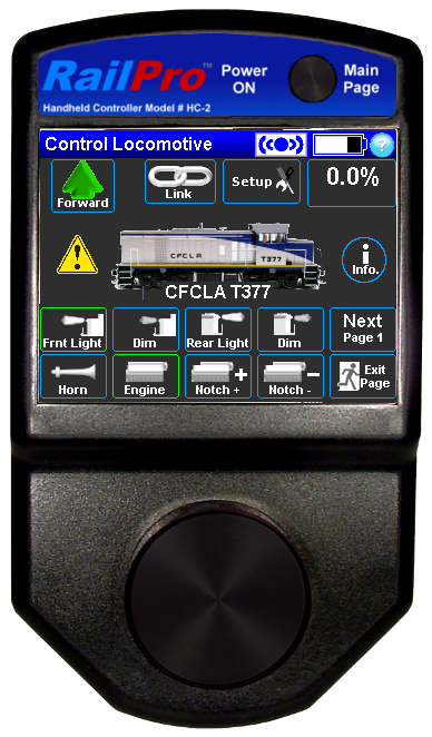
I had thought about this awhile ago and while watching a cab ride video today I decided to make a mockup of a less white screen for RailPro. Computer screens in the real thing, as far as I have seen have a dark (usually black) background and high contrast text and buttons, the black screen being better for low light driving so here is my idea of a couple of less white screens for RailPro.

hc high contrast idea.png
Mockup 1

hc high contrast idea v2.png
Mockup 2

I fiddled around with the button placement, I think it looks less cluttered this way. One thing I'd like to see regardless of a less white screen or not is the whole button turn green when active, not just that little dot in the top left corner of the button.

Now I know that dark grey, white and green (nor mid blue for that matter) are not the official colours of RailPro but I'm the customer and I don't care about that.

A less white screen would be good for those that like to do low light running (either the layout is in nighttime mode, or the operator aisles are dark) and also those that just like a little less white, like me.

What does everyone think?

Edit: To really appreciate the difference between the low light screens and a normal RP screen, you'd need to view the low light screens on a dark page background with the lights dimmed. I have created a page to allow people to do that but I'd have to find somewhere I don't mind uploading to to upload it.

- Tim
« Last Edit: February 16, 2018, 10:05:39 AM by G8B4Life »

nodcc4me

  • Conductor
  • ****
  • Posts: 688
  • RailPro Fan
Re: A less white (low light) screen idea
« Reply #1 on: February 16, 2018, 10:18:44 AM »
Nice work, Tim! I like them both, but as a preference, the second one with the blue buttons would be my choice. Turning green upon activation is a great idea.  :)
Al

Run your train, not your brain. Get RailPro. It's a no-brainer.

Alan

  • Conductor
  • ****
  • Posts: 1073
    • LK&O Railroad
Re: A less white (low light) screen idea
« Reply #2 on: February 16, 2018, 10:50:22 AM »
Totally agree about a dark screen. I am biased to dark gray backgrounds because I spend so much time working in Adobe Creative Suite. I love their dark user interface. So much so that when I am forced to work in MS Office or some other program I find the white backgrounds overwhelming and eye straining. And yes, the RP white is like a beacon when operating with the room lights turned down. Even with the brightness set as low as it goes. I would totally load the dark screen theme on my HCs.
Alan

LK&O Railroad website

When I was a kid... no wait, I still do that. HO, 28x32, double deck, 1969, RailPro

nortoneye

  • Engineer
  • ***
  • Posts: 97
Re: A less white (low light) screen idea
« Reply #3 on: February 16, 2018, 04:03:08 PM »
I like it!  #2 is also my preference.  This would be a great update.

jim

PerezBill

  • Fireman
  • **
  • Posts: 17
Re: A less white (low light) screen idea
« Reply #4 on: February 25, 2018, 06:33:07 PM »
I love the dark screen. It makes it so much easier to see in my eyes. I personally prefer choice #1. I like the less amount of color on the screen as it makes it easier to see when a button is pressed. Not sure if this is a factor or not but the less use of color might help the battery last longer.

G8B4Life

  • Signalman (Global Mod)
  • Conductor
  • *****
  • Posts: 1236
  • I'll think of a catchy tag line one day
Re: A less white (low light) screen idea
« Reply #5 on: February 26, 2018, 05:53:07 AM »
Thanks for the comments folks. I prefer the outline version myself, and not just because I know what I'm going to type in below!

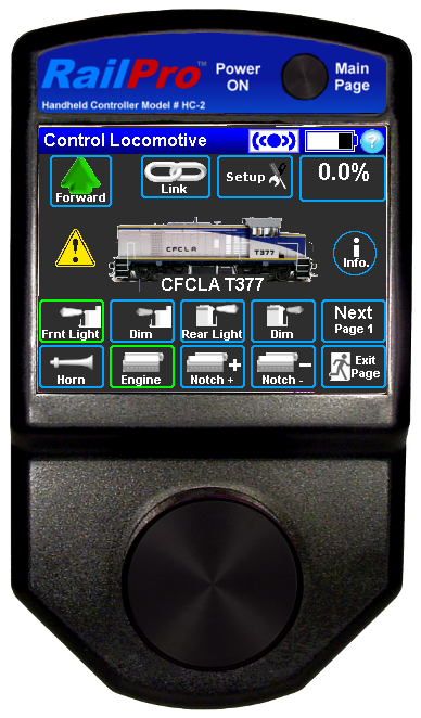
I've actually been working on this (going through every screen) but hit a big problem with it last night, so this is the latest mockup of just the Loco control screen. It's based on a really cool controller I get to use at work. It's been doctored from the white outline one previously posted (couldn't post a new one... that big problem).

I've done a 2px wide outline and a 1px wide outline mockup to see the difference. I like the 2px version better.
Dark UI blue thick outlines v1.png
2px wide outlines

Dark UI blue thin outlines v1.png
1px wide outlines


Now, here's the thing about how this would all work.

Turning a whole button green (like the front light in the previous mockups) is not going to happen unless we want to give up a lot more space. To turn a whole button green, or any other colour for that matter would require a duplicate button in the colour you want an active button to be. There are currently 73 buttons you can assign to functions so that would make 146 buttons would be required; and no RP doesn't support Alpha channels as far as I know.

Turning the button outline green as in this posts mockups should be doable but may be a programming PITA. This would require 4 extra images (top, right, bottom and left of the outline) and these would simply be overlayed over the blue outline. This is how the current method of indicating an active button works with that little green dot.

The little green dot could also stay, and would be the easiest (and the green dot is more visible on the dark grey than the dark blue). A red dot could also be part of the button and the green dot simply overlays it.

In the mockups, I moved some of the buttons to what I think are better positions however the position of buttons on the controller as of today probably won't change.

I really think this UI makes for a much more modern and pleasing look to the controller, and I'll keep working on it so I can take it to Tim Ring. If anyone has other comments I'd like to hear them.

- Tim

nodcc4me

  • Conductor
  • ****
  • Posts: 688
  • RailPro Fan
Re: A less white (low light) screen idea
« Reply #6 on: February 26, 2018, 06:29:01 AM »
I agree that the 2 px looks better. It’s easier to see. The green dots would also be helpful.
Al

Run your train, not your brain. Get RailPro. It's a no-brainer.

Dean

  • Conductor
  • ****
  • Posts: 211
Re: A less white (low light) screen idea
« Reply #7 on: February 26, 2018, 08:32:45 AM »
Looks good. Picture #2 is the best IMHO. One question. What happened to the MU= button?
Dean

TwinStar

  • Conductor
  • ****
  • Posts: 513
  • Modeling a 1961 Rock Island Twin Star Rocket
Re: A less white (low light) screen idea
« Reply #8 on: February 26, 2018, 11:29:58 AM »
Tim,

That looks great and I like the 2px wide as well.

Wonderful idea. Hopefully it's well received.
Jacob Damron
Modeling late 1950's Dallas Union Terminal in Free-mo+ modules

Texas Railway Modeling and Historical Society trmhs.org
trmhs.org

nortoneye

  • Engineer
  • ***
  • Posts: 97
Re: A less white (low light) screen idea
« Reply #9 on: February 26, 2018, 01:54:54 PM »
Thumbs up for 2px outline, also wondered about the MU button.  Moved to the set-up button?